Build a Killer Website: Part 1
When users first arrive at your website, it takes less than a second (about 0.05 seconds) for your site to make a first impression based on how it looks, and for the users to decide if they're going to leave. The way a site visitor initially perceives your website is the basis of how they see your brand and your company. The easy answer, obviously, is to build a killer website. But not every business has the tools, resources, or skills required to build a good one—let alone a high-converting one.
It takes less than a second for users to decide if they're going to leave your website.
Building a website can be a complicated business, and depending on the size of your operation, you may not have anyone else to count on to do the work for you. Even if you can afford to pay a team of professionals to do it for you, where do you even begin? Don’t worry; we're here to help.
In this series of posts, we can give you some guidance on how to design and build a website—whether you're using that site to get more bookings of zipline adventures or to sell more "Like a Boss" coffee mugs. So buckle up; we're about to help you make a good first impression.
Step 1: Establish Your Domain and Web Host
First and foremost, if you want to have a "home" online, you need a place to put it. That digital location, the web address reserved for your stuff, is called a domain.
If you want to have a "home" online, you need a place to put it.
The simplest way to get a domain name is to purchase one from a web hosting provider. A web host is where all your site's images, content, and other files will be stored. If your domain is the address to your house, the web host is the plot of land that it's built on. There are many reputable hosting providers like Dreamhost, Rackspace, and Liquid Web to name a few.
Once you have your domain and hosting provider settled, you'll need to put something there for people to visit. This can be done in one of two ways: either code it yourself or use a website builder. What's the difference? It’s kind of like the difference between building your own house and buying one that's already built.
With the former, you get exactly what you want, but it takes longer and costs more. With the latter, all you have to do is "furnish" it—i.e. you drag and drop the options you want into the site builder. You lose out on a little customization, but you save a lot of time and money. Additionally, with website builders, you cut down considerably on the cost of maintaining your site.
Step 2: Develop an Up-to-Date Website
If you're reading this, odds are you aren't a coder, a programmer, or a developer. Your expertise likely lies elsewhere (like whitewater rafting, adventure course design, or off-road adventure tours). There are still a few things you need to pay attention to, and a few important areas you can focus on to make sure your site runs properly.
Maybe even more importantly, since search engine algorithms take how your site is built and how it operates into account, there are development-based issues that can affect how visible your site is online. Let's cover the three most important items.
Mobile Friendly
Over half of today’s web traffic is generated by mobile devices. That means half of the users that visit your site are looking at it with a much smaller screen. Your site needs to be designed in such a way that it looks and functions in a way you’ll be happy with, regardless of the device used to view it.
Over half of today’s web traffic is generated by mobile devices.
Now, we’re not going to get into the weeds here and differentiate between responsive design and mobile-friendly design. What you need to know is that if your site looks like garbage on mobile, half of your visitors will assume your business is garbage and bounce like a fully inflated basketball.
Again, this is something that will at least partially be taken care of if you’re using a site builder. But that’s not a guarantee that your site is performing well on mobile. So if you find your bounce rate is uncomfortably high, talk to customer support (or your local designer), and see what you can do to optimize it.
Site Speed
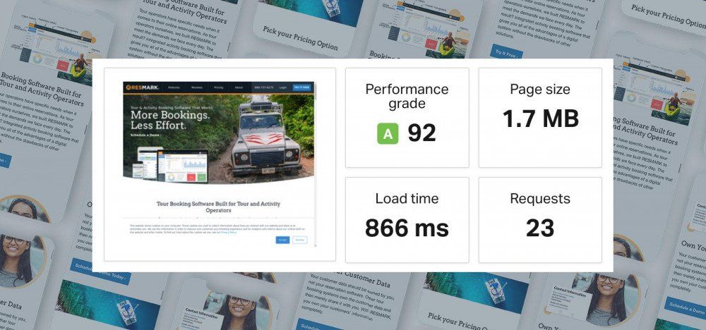
Next, we have site speed. This is a measure of how quickly pages on your site load on the device being used by the visitor. Now, site builders are going to (again) help with this a little, and making your site load faster takes some pretty technical knowledge. But even without that specialized skill set, you can still do your part to cut down on lag.
One of the biggest factors that contributes to site speed is how resource-heavy elements on the page are (especially images). So, if you want your pages to load faster, you can reduce the size and resolution of images and associated files (javascript, css, etc) on the page.
Now, we know we just barely got done telling you that you need high-quality images and video. But that doesn't mean you want a page filled with 8MB images. Its critical all images are resized to web dimensions (below 1600px wide) and optimized for the web when saved (lowering your images file size). Also, the number of images and javascript/css calls on the page will affect load time.
Step 3: Design an Engaging and Easy to Use Site
Design is a pretty big umbrella, and a lot of different things fall under it. In this post, we'll start with two basic concepts, and focus on more artistic elements in a future post. What’s most important is the lesson that you don't have to be a web designer to make the site give a stellar first impression. You just need to follow a few of the important guidelines below.
Layout
In many ways, how you arrange your design elements is as important as what those design elements are. Now, there's a lot of complicated "rules" that designers are keeping in mind when they are setting up the layout of a web page, but the core concepts are pretty easy to understand (and to remember).
When design elements are used properly, it will show the user what is most important.
Visual Hierarchy is a term that refers to how you draw the eyes of users to certain things on the page by using visual cues. When design elements are used properly, it will show the user what is most important, and guide them toward the parts of the page you want them focusing on (like, say, the "Call to Action" button; more on this below).
Here are three key design elements all high converting websites use in their layout.
Size
This one is the most obvious—larger items on the page will seem more important. It's why titles are bigger than section headers, and why section headers are bigger than the text in the body. We draw attention to things by making them harder to miss. So if you want people paying attention to something on the page, you can increase its size (or bold it for a similar effect).
We draw attention to things by making them harder to miss.
You can overdo this, though. Obviously, if your "book now" button fills the screen it’ll look a teeny bit weird, so use a little judgment as to where and how you apply this.
Placement
You also need to be careful how and where you place things on the page because it affects where the user places their focus. Obviously the top of the page ("above the fold") is the most important, so you'll want your primary headline prominently placed in this position.
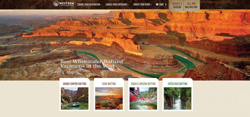
Often, this is accompanied by a large image called your "hero." But placement is also important "below the fold." For instance, elements that are grouped together will look related or connected, and having one element above another will make the higher element look more important.
Without a proper hierarchy, everything looks equally important, or in other words, nothing looks important.
What you want to avoid is a lack of hierarchy of hierarchy. Without proper placement, everything looks equally important, or in other words, nothing looks important.
Spacing
Rounding out our coverage of design topics is spacing. Bad and inconsistent spacing is common among many non-designers. Most of those among us who are not designers have a tendency to want to cram in as much information on the page as they can.
Let your page elements breathe.
The problem is (as any designer will tell you) text, images, videos, and other elements need room to "breathe." Put elements too close together, and everything ends up muddled and confused. In fact, leaving plenty of white space around the most important elements emphasizes them even further. Apple, for example, has sort of cornered the market on using white space for emphasis.
Bottom line: don’t be afraid of white space. Let your page elements breathe. Your website visitors will thank you for it.
Navigation
If you've laid your site out properly, users will be guided toward the content you want them to see. But you also need to make it possible for users to reach what they want to see. In other words, you need to make it as easy as possible for people to find the content they’re looking for on your site, whether that be your contact information, your features page, or a specific item you sell.
Good navigation makes pages easy for users to reach. Bad navigation makes content hard to find and access.
This is where site navigation comes in. Good navigation makes pages easy for users to reach. Bad navigation makes content hard to find and access. And when it comes to making it possible to navigate to a page on your site, you have three tools in your toolbelt:
- Buttons in the top navigation bar
- Hyperlinks at the footer of the page
- Hyperlinks or buttons in the content of the page
That's also the order in which they are most easily accessed. Obviously the top navigation menu is both the easiest to see, and the easiest to reach, and it's on every page. The footer is fine, but people have to scroll all the way to the bottom to find it. Lastly, embedding hyperlinks or buttons in the text is risky, because you have to trust that people will read all of your copy, and most people don't.
Our advice: put your most important pages in the navigation menu. Links to your home page, your contact page, your support page, and your features or product pages are all great links to include. You may also want to include your blog if you have one (and you probably should—more on this in a future post), comparison pages, search buttons, "view cart" buttons, review and testimonial pages, about pages, FAQ pages, and the like. If you need to conserve space, just use drop-down menus.
Your page footer (the bottom of the page) is a great place to repeat your top navigation bar, or to include the less commonly visited pages that you didn’t put up top. "Meet the Team" pages, "careers" pages, links to any video or audio content you do, privacy policies, terms of use, and terms of service are all good candidates for this.
As for links in the copy, use those as "second chance" links to the pages you actually want them to see (especially your "contact us," "schedule a demo," "book now," or product pages). That way, if people actually do read your copy, you’re still moving them further down your sales funnel.
Your navigation should have a hierarchy—an indication of which pages are most important.
Above all, much like your layout, you want a sense of hierarchy—an indication of which pages are more important than others. How do you do that? By using a little psychology. On your top bar, for example, the first and the last button will stand out and seem more important. Try to reserve those for your "home page" and "try it free/buy now" buttons, respectively.
The same also applies to vertical lists and drop-downs: the closer to the top, the more important it seems. Avoid nesting drop-down menus, as that can get clunky, cumbersome, and confusing.
Make sure your CTA buttons stand out so they're easily seen.
And finally, when you're using CTA (Call to Action) buttons, make them stand out so they're easily seen. Make sure the text contrasts with the button color, and the button color contrasts with the background. Make the wording clear and direct (like "buy now" or "try it free"; see above). And try to save the "ghost buttons" for secondary actions like "learn more" or "contact us."
Step 4: Add Visuals to Your Website
While how you present the content on your site is important, the best visual hierarchy in the world will be wasted effort if the stuff on your site looks unprofessional. Now, not everyone's a photographer or videographer, but that's not really an excuse for displaying grainy photos you took with a flip phone on your site.
Not everyone's a photographer, but that's not really an excuse for displaying grainy photos on your site.
If you want people to take your business seriously, if you want them to book online, or purchase online, or sign up online, or do anything on your site, you need to look like you know what you’re doing.
Images
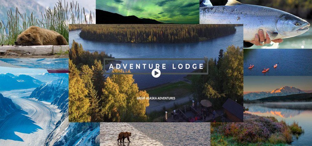
In most business contexts, images come in two forms: photos and graphics. For photos, your best option is to hire a photographer. It will give you exactly the pictures you want, and they’ll be high quality. Not everyone has the budget for that, though, so you have two alternatives: take the pictures yourself, or use stock photos.
Some stock photos are free to use and can be placed on your site without worrying about who owns it. Others you'll have to pay for, but the cost will be a lot less than paying a photographer to take an original photo for you.
Just be careful you're not using photos that look too much like stock photos, or that are in prominent use somewhere else. The last thing you want to do is add a picture to your site that’s used thousands of times a day for internet memes.
As for graphics, you'll probably have a hard time finding stock graphics that meet your needs, so you have two options. You can learn to tool around in image editing apps yourself, or you can hire a freelancer to do a one-time job.
Sites like upwork.com, designpickle.com, and fiverr.com give you access to hosts of designers who are willing to do the work, and because you’re only paying for a single project, you won't necessarily have to pay through the nose for the image.
Video
Video is a little bit harder; high-quality videos are more difficult (and more expensive) to produce. That said, if you pick up a little bit of savvy and the right equipment, you can get away with a lot. Here's what we mean.
If you pick up a little bit of savvy and the right equipment, you can get away with a lot.
Your videos (should you decide to do any) don’t have to be ultra-polished, big-budget productions. You can actually do really well with a halfway decent camera, some simple equipment, and a little bit of branding.
Cameras are pretty easy to come by these days. And while you certainly can spend thousands on a high-end device, you don't have to. Even iPhones and other quality smart devices have way better cameras than the polaroids we used to use back in the 90s.
If smartphones aren't your thing, you can pick up a dedicated camera from most tech shops. Point and shoot cameras work fine for most things, but you can go for a camcorder if you’re doing a lot of video content. Or, if you need action shots for your tour business, you can use drones or a GoPro.
Once you have a decent camera, what you'll need is something to hold it for you (since human hands tend to be a little shaky). If you're doing action video, you'll need something to hold it in place during all the ruckus. If you're doing stationary videos, you'll want a tripod.
If you're not doing action video, you'll want to get a good microphone for best sound quality— either a stationary mic or a wearable one. With those three things alone, you'll dramatically improve the quality of your videos.
Beyond that, you can get into video editing. The professional apps are pretty expensive, but there are some free ones out there. With those apps, you can add graphics, transitions, music, and more, leveling up your production game even further.
Keep in mind too that you don't have to jump straight into the deep end. You can start with a camera, and slowly work up to the other stuff as your time and budget allow. And finally, remember that you can always do another take if you’re not satisfied with the previous one. Just like Hollywood, you can always "fix it in post."
Conclusion
Following these basic steps in this post will ensure you have a firm foundation to build or redesign your new website on. In the next post in this series, we’ll give you tips on how to start getting more traffic to your (now new and improved) site.
Share This Post

